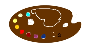
Winsor and Newton 45 pan palette
The 45 pan student grade palette contains all 40 Cotman series of paints in pans that are too loose in the box. It also has 5 duplicate pans of some popular colours. If you have a palette like this, what did you change? How did you solve your problems and be happier with your purchase?1 Personally, I didn’t see the point of 5 unused colours. My first task was to find 5 Artist Quality Professional Watercolours (PWR) I liked that were NOT in the palette or whose pigments were superior.

I chose:
Naples Yellow
Opera Rose
French Ultramarine
Cobalt Turquoise Light
Davy’s Grey
2 I reordered my pans into the sequence that suits me as an artist. My Clever Resourcing facebook page https://www.facebook.com/CleverResourcing post on 1st Feb 2020 has details of why I chose these colours. Naples Yellow, though a neutral colour with a PBr numbered pigment rather than a yellow PY numbered colour. Palettes are also usually arranged with the lightest shade on the left. My decision to reposition this colour was based on my use rather than pigment use. My history as an oil painter meant that the different properties of oil colours means that a slightly warm white like Naples Yellow comes between white and the first true yellow. Oil paint palettes are typically oval and the white turns the arc of the circle tighter, so it can be a much larger amount of paint in the cetre, close to all the colours to allow them to be tinted lighter. Watercolour palettes are hardly ever traditional palette shaped. The wells of water in the palette is where mixing is done. Adding more water lightens the colours before artists think about adding white. It keeps colours brighter.
Note: In arranging palettes, function rather than strict technical order carries greater importance. Arranging manufacturing plant and processes, what is more efficient typically carries the day. Changing order involves breaking habits and training in new systems. Large plant cannot be rearranged easily. It has no will or practice, but it may need to be extended.
Vandyke Brown was moved before Burnt Umber. That means that 3 opaque colours including the natural reds, preceed 3 semi-transparent colours. Paints with joint properties are together. As a watercolour student with a view to increase my skills and knowledge, Aids to help me remember the adanced level benefits of semi-transparency or full fransparency really helps me to master glazes of one seethrough paint layer over another.
Traditional oil paint palette

As a temporary fix, Cutting small rectangles of sponge scourers holds the pans in place without any permanent changes! They also soak up excess water and allow me to practice drying my brush before loading with stronger pigment and achieving some painting effects like multiple twigs on trees in winter. It is much faster than trying to paint each branch with a rigor brush.
4 The palette kit includes a brush. However just as most woodworkers can never have too many clamos, artists love buying a few more brushes. The brush tray in the Cotman 45 set is quite wide and several thin handled brushes can be carried together when I travel on holiday. I added a rigger and a small fan brush. The handles are short, so I added a short pencil and an unusual holder for masking fluid. Again, details on my facebook page.

Wherever employees add quick fix, nice to have extras around a working place, tThere are two palette mixing areas. One could be removed to make it less likely to break the plastic. Just as employers need to listen to what improvements would help workers, feedback on palette design is usually welcomed by other artists and palette manufacturers. Over time, improvements may be built into product development.
5 With my adaptations to my palette, I needed a paint swatch – a summary of my paint pan order plus the new ones. I wanted additional information like opacity/transparency and granulation/staining from each pigment. Things I needed to learn as my skills develop. The leaflet that came with the box was a good starting point, but I can’t update it. The Winsor and Newton website contains less information about pigment qualities than I wanted. Their aim is to simplify information for complete beginners. I feel that complete beginners would not be buying such a large painting set! Putting N/A (not applicable) in tables is not helpful to me. These qualities are available but it takes some searching and interpretation of paint development changes over time to track down the opacity of every colour for example. Please don’t assume that the same colour name in the artist PWR series of paints is the same opacity or granulation. In some cases the pigments are quite different, even though the hue or colour looks similar. Generally PWR colour pigment qualities are widely available.
So… I have to create a swatch, I might need to change the order of paint pans and I might swap out colours for PWR paints and I need to document what I use for myself. Perhaps other artists have similar needs. I developed a word document with a 15 pan x 3 rows arrangement, spaces between so paint would not mix, and all the colours included as a text which I can copy or change as required. WN 45 palette
Click on the link above for your Word document. It is not copyright, so please use as you wish. If the document is useful, please let me know – and I would love to hear by email or facebook, your thoughts on the Cotman 45 pan palette and how you use or changed it.
This is what you will be able to download:

Cotman 45 Palette template
Regards
Deb Stevens
Technical and Business Communicator & Artist
Leave A Comment